Vantage Points and Visual Practice • Visual Practitioners Africa 2021
Had the great pleasure and privilege to speak virtually for the first time on the continent of Africa today (and beyond). Lita Currie, of 3Stickmen invited me to speak at Visual Practitioner Africa.
As Lita and I bounced around ideas, I thought of MG Taylor's Vantage Points Model and how gathering Visual Practitioners always has colleagues talking at totally different vantage points.
One may be talking about what is the Culture and behavioral norms of our community. Another is at Task level choosing markers.
Both are within our realm of our work.
Both are valid conversation topics.
And it can be hard to find common ground when we're all sitting at different vantage points simultaneously.
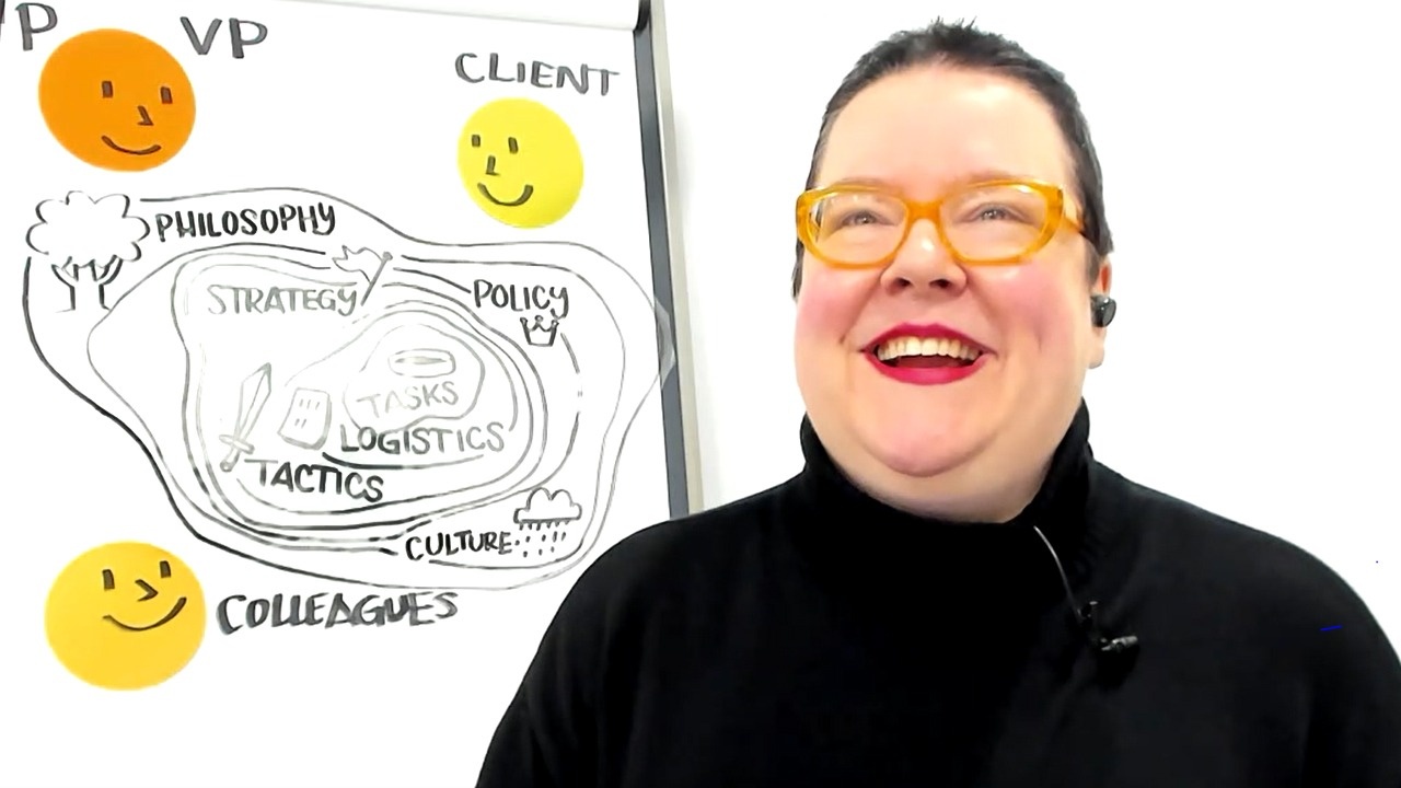
Here's my quick rendition of the model:

I used the model to share my top insights from each of the 7 vantage points in regards to my graphic facilitation career. FUN FACT: This month is my 25th Work Anniversary!

The aerial view of my 50 minute talk:
Task: Develop ALL of your skills, not just drawing, and that you can practice between projects.
Logistics: Advocate for yourself with your clients. Ask for what you need to do your best work.
Tactics: Refine your process and systems from project to project.
Strategy: Every one of us chooses the long-term business strategy that works best for themselves. All are valid approaches.
Policy: Say yes until you figure out what you say no to. Implement policies that create healthy professional boundaries.
Culture: You demonstrate your values, your culture, with every client and every colleague you interact with. There are different cultures within your field. Find who YOU resonate with.
Philosophy: Define your own philosophy of this work and hold onto it. It will bolster you when you're dealing with nonsense at other levels.
My last little extra something is that part of my longevity is always having my own work, where I make all the decisions.
☝️ This advice reaches far beyond this specific work. If all your creative energy is consumed serving other people's ideas, it'll erode your soul. Have work that is entirely yours.
There was lots, lots more in the talk, but that's the broadest strokes.
Here are some peeks into my process:
Faces or tops of heads?
I got up and online early enough to catch Sam Bradd's session before me. Excellent and generous talk, as always. He mentioned how when you talk to visual practitioners, everyone is heads-down, making their own sketchnotes. As the speaker, you see a sea of crowns. Few faces.
I know my colleagues well enough to know that they WILL try to get every detail of a model. I did not want the participants treating themselves like recording devices. Getting every detail, but not having their own experience as a learner.
To help my audience be more present, I did two things:
1 | I started the talk saying, "I know you're inclined to get down every detail of the model I am giving you. I want you to listen to my stories and see how you relate to them. This talk is for you. I want to see your faces."
&
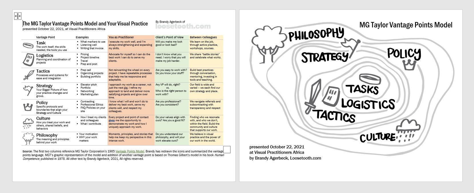
2 | "To that end, I made this very detailed PDF of the model and this chart that I will add to the chat window at the end of the talk. I've got you covered." And I did just that, uploading a two page PDF at the very end. Here's a thumbnail as a glimpse at the level of detail.
If you are inclined to give the PDF at the start of the session, know that you're now splitting the audiences attention between you and the PDF. Also, they are noticing everything you didn't say that was in the PDF. This particular PDF had far more detail, by design, than what I said out loud.
This strategy happily worked. I got to see them listening and taking in the stories for themselves, not for the piece of paper.
3 Points of View
In the PDF thumbnail above, you'll see the columns on the right are color coded. This was to correspond to the three faces on the flipchart. The three perspectives all looking at the model:
- The visual practitioner - orange
- The client - green (looks quite yellow in the screenshot)
- The visual practitioner colleague - yellow
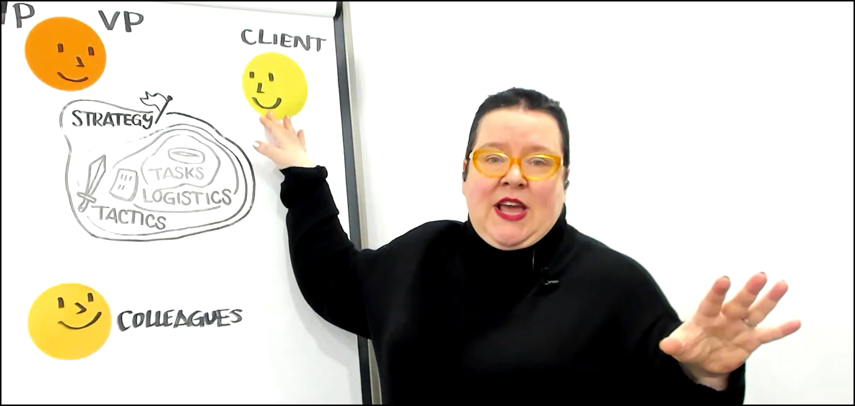
I didn't hit each point of view at every vantage point, but I did complete these in the PDF. In 50 minutes, I could not be that thorough. Not sure I would even want to be that detailed for this presentation.
It is good to learn in phases. Different levels of details, in different forms (my speaking, the flipchart, the handout).
Revealing the model
Drawing live is pretty magical at capturing the audience's attention. But as the speaker, I would have been far too slow. Besides, I needed the model drawn to add to the handout.
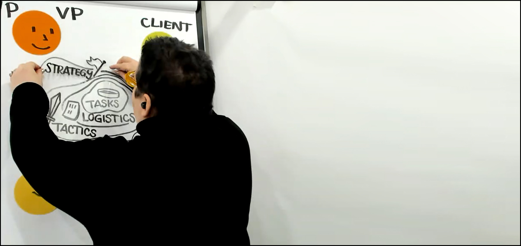
I drew each level of the Vantage Points model on its own piece of static transparency. I used Neuland's Estatics XXL. I used the permanent ink of the Neuland Outliners.
I had the layers lined up on the wall behind me, and grabbed them one by one and added them to the flipchart.
Thinking in Contrast
Normally, I zealously use my own idea shapers of The Trio. With the Trio, I would color my lines like you see in the digital version, the topographically lines in lighter gray so they recede. Seeing something in all black and white is not my style.
This was a choice knowing that I had some reflection off the plastic and that with an African audience, folks may have lower bandwidth to connect through Zoom. I wanted the highest contrast I could get.
Therefore, black and white with thick, solid lines.
When we logged off for the day, I checked out the conference Miro board and was delighted by this portrait. When I hear who drew it, I'll edit this and share their name.
Loved the opportunity to go meta in the pic on the left.
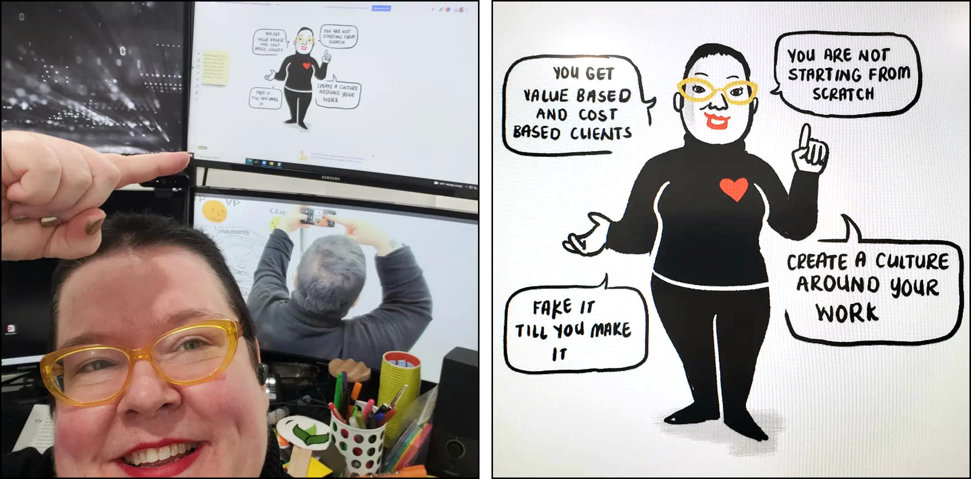
I'm standing in front of Winky, my Teaching Robot's 4 monitors. In the upper right in the Miro board. Below that is the computer connected to my main camera.
While I spoke, I could seeing the participants in Gallery view and the chat across the top two monitors. My lower left monitor shows me Zoom (and my slides when I use slides).
I'm not sure where this talk will "live," but I will add it to my two graphic facilitation courses as a bonus. Gold Star Graphic Facilitation in about the work in the room. Graphic Facilitator Confidential is about the business side - getting into the room.
Also, if you're in my membership at Studio+ or Camp Drawmore, I did a Studio Live session earlier in the week, where I walk through prepping for the session and archived it in our shared space.
So darn thankful for this opportunity to reflect, share my experience with a new audience, and to create a new resources for fellow visual practitioners. Extra, extra thankful to have fallen into this field 25 years ago, into an environment that combined MGTaylor's brilliant methodology with (then) Ernst and Young's varied management consulting clients.

