Value of the Program
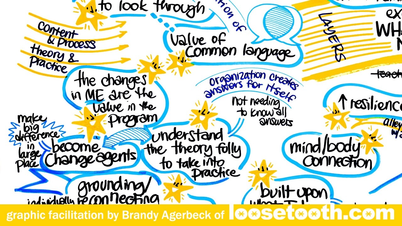
My latest graphic facilitation project was a program capstone session. Reflecting back on the program, acknowledging the accomplishments, celebrating successes. Here's one chart from the day: 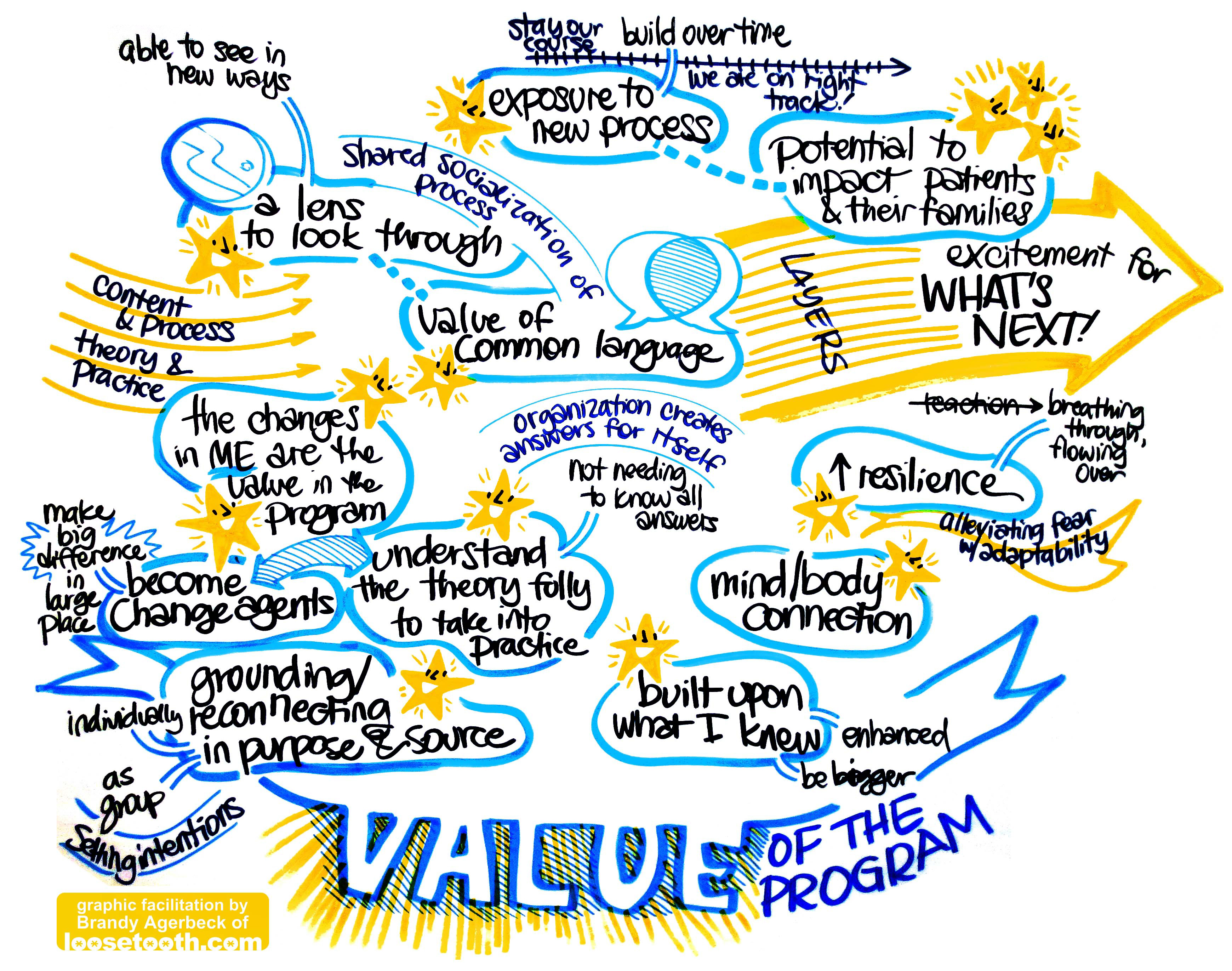
I mean who doesn't want to be part of all this good stuff?
These shining, smiling stars made great mascots for all the good stuff. 
And the value shines too. Here I started with the blue hatch marks to popped the letters of the VALUE out. But the farther the conversation went, the more I wanted to add the yellow radiant lines as well. It's not often I layer this kind of shading, but I love how it give the topic of the conversation more weight down there at the bottom of the chart. 
This chart is also solid demonstration of how I limit my colors, beginning with a trio. Each color has its own job to do in the drawing:
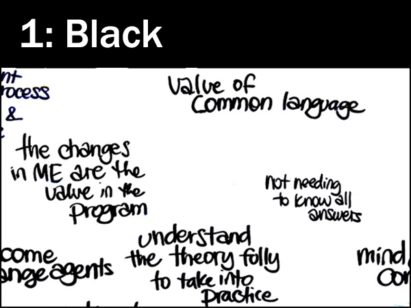
Most all of the content, the words are draw in black because it is the highest contrast to the white paper. The black letters pop forward. Content is king.
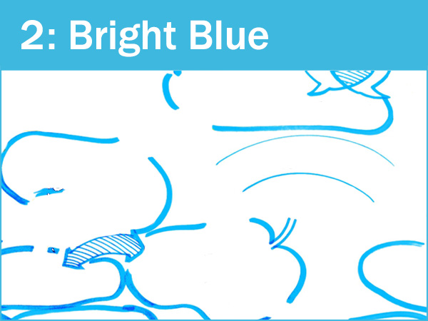
All of the connectors and containers in the drawing are the job of bright blue. As a lighter color it is lower contrast than the black and it recedes in the drawing.
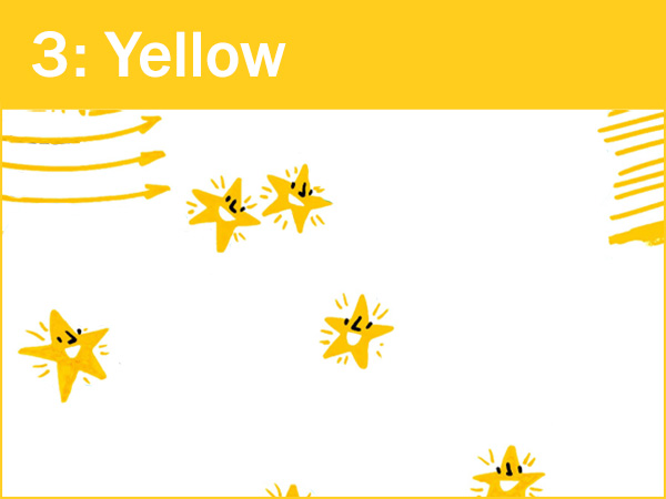
Yellow is another lower contrast color and the natural pick for my gold stars. Being another bright, primary color alongside the bright blue, it gives the chart a lot of vibrance.
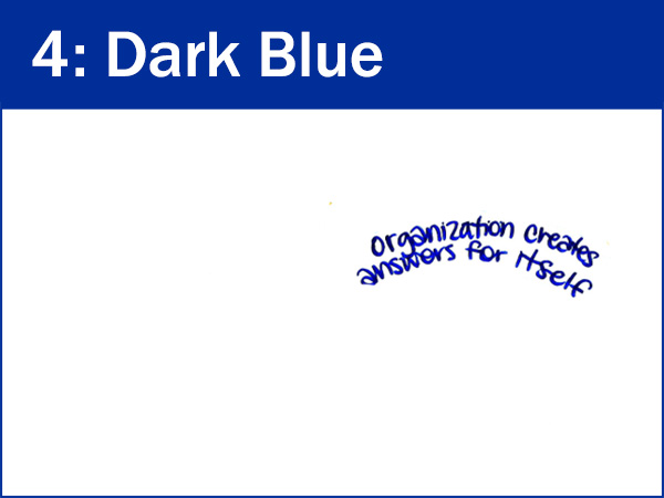
I need to add a 4th color in when I had a new job needed to be done. This dark blue was used to pull out a theme from the text. I made it darker than my bright colors, but distinctly different than all the black text.
And you'll see areas where the connectors and containers and other icons look dark blue, not bright blue. That's the lighting in the space. I'm often in poorly lit rooms and need to color correct my images to get them closer to the original.


