How to Choose Colors in Your Visual Thinking Using The Trio
Such a great live call today in Loosetooth Studio that I wanted to share.
Within our virtual studio space, we have a special space for folks what are in The Agerbeck Method course. That is my big, chunky, delightful, foundational course on visual thinking.
The course is divided into nine modules:
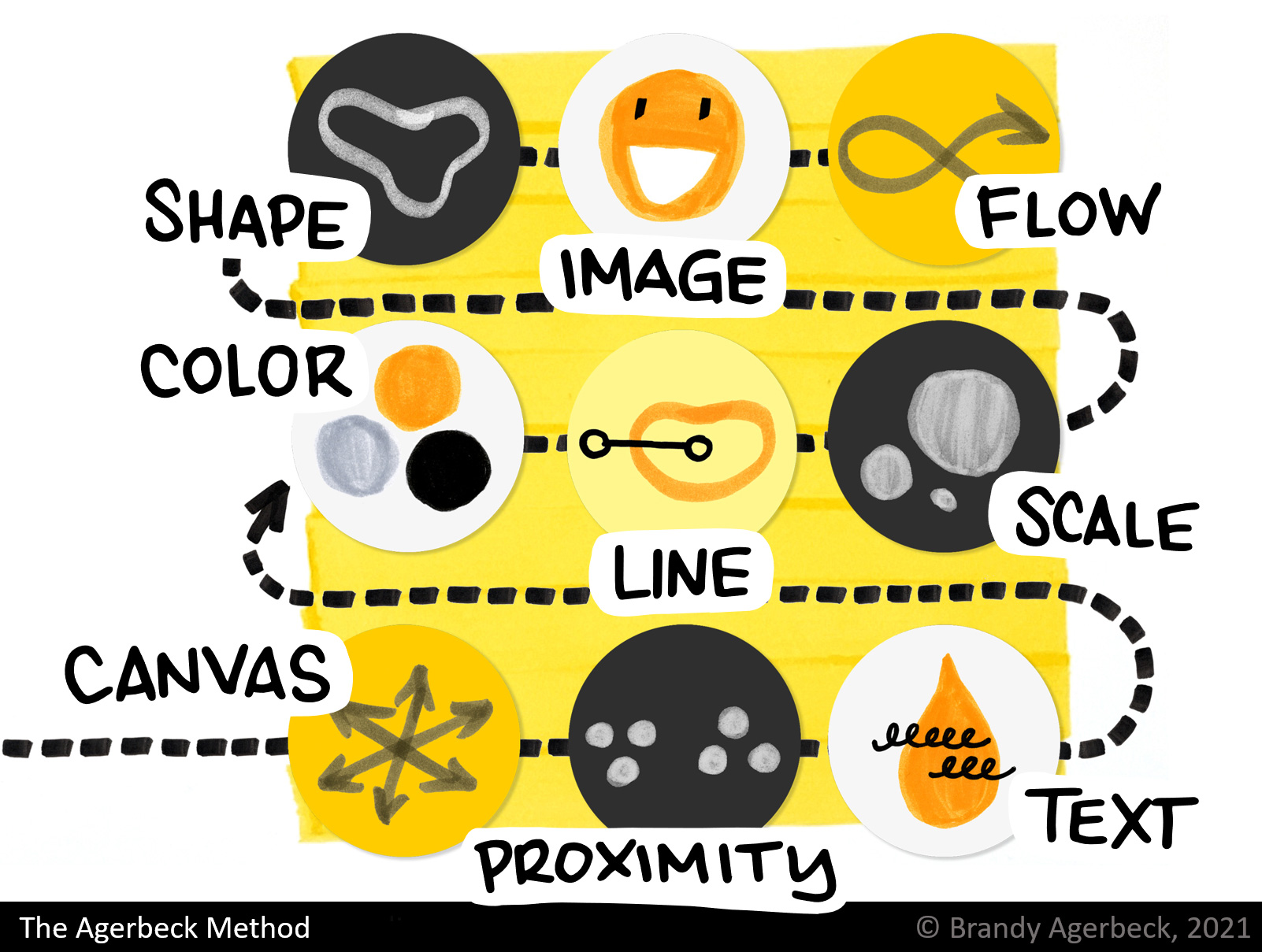
Each module tackles one category of choices within your visual thinking.
The way I define visual thinking is that anytime you're making a drawing, you're making countless choices. In contrast to writing lists, texts, paragraphs, when you make your thinking more visual and spatial, you have many more choices.
These additional choices help you see patterns, make connections between ideas, tap into your intuition or cues in your body more clearly. You have more tools to tackle complexity.
When you are making that drawing -- full of making choices that make meaning -- that drawing becomes your first step, or your next step, in making great things happen.
You may you look at a blank piece of paper, and think, "That is too scary. There's too many choices."
The beauty of this is there's countless choices. So much can fit on that blank piece of paper. It can be daunting.
That is why I am here.
I love to teach you about these visual choices, and the meaning that they make. Sharing guiding principles that help you become far more confident, capable, and ready to kick this piece of paper's backside.
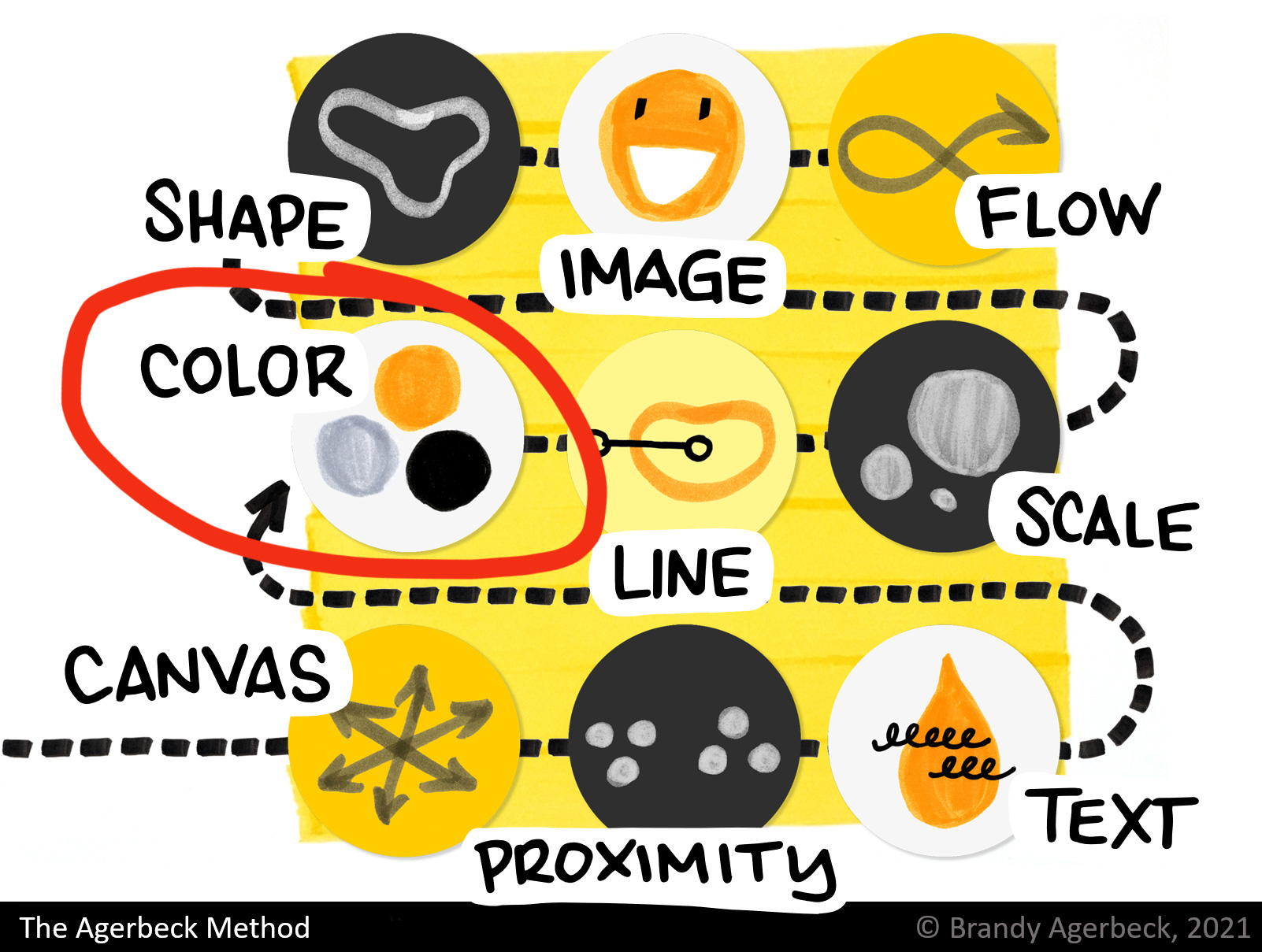
In this video, recorded after today's Loosetooth Studio live session, we talk about choosing COLOR.
We had a wonderful question come up.
First, a little context.
In the fourth module, we talk about 2 idea shapers:
- The Spectrum - color coding and organizing ideas by color
- The Trio - choosing 3 colors to create layers of information
My overarching principle on color is:

Folks often think that the MORE colors, the better! That more colors = more visual and more creative.
Eh. No.
The issue is if you're not making a meaningful choice in each of those colors, you're causing confusion for yourself or confusion for the people you're working with.
That's what I call clown barf.
Heck, use as many colors as you'd like, IF each of those color has its own meaning within the drawing.
In The Trio, I teach beginning a drawing with 3 colors selected.
Each of those three colors has its own job.
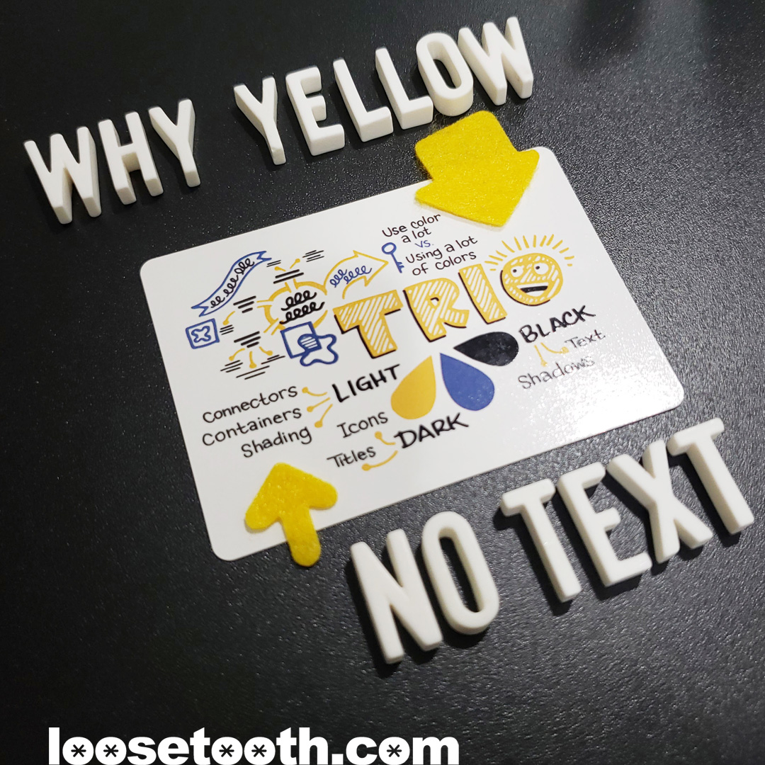
To that end, here is an example of a possible Trio:
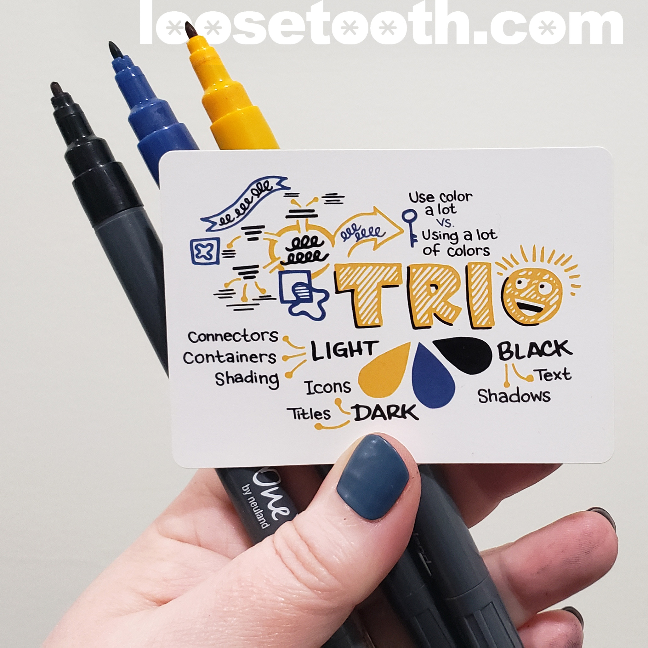
This is one combination in my 72-card Trio Deck.
Each color has its own unique function:
- Black = highest contrast to paper = Its job is to writing most of the words, the content.
- Light = lowest contrast to paper = Its biggest job is the lines that connect and contain ideas.
- Dark = inbetween Light and Black in contrast levels = It picks up the job in between like themes, categories, diagrams, icons.
Onto today's GREAT QUESTION --
The very important and smart question that Veronique asked today in our session was, "Why is 'TRIO' yellow? Why is it in the lightest color?"
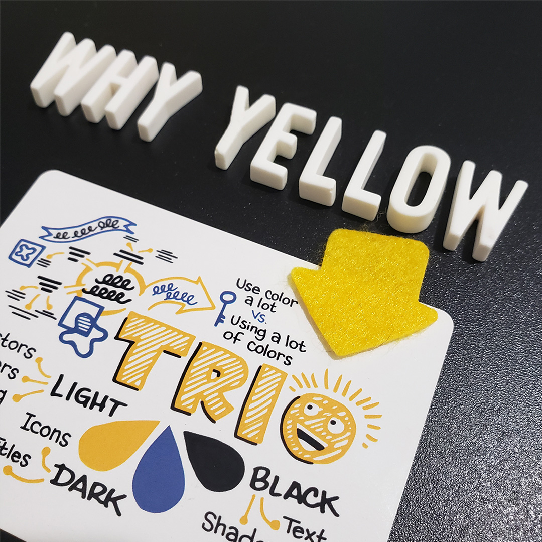
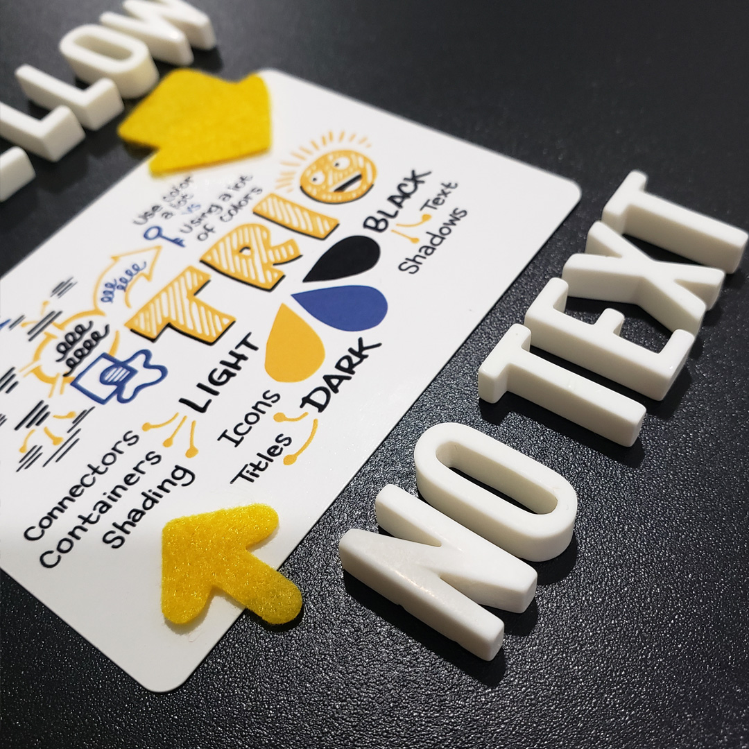
You can see I don't list text in the light color's job description. Yet, here the MAIN word is yellow.
The idea shapers are guiding principles, none of this has ONE way things have to be done.
I never call these rules, but there ARE things that work better. A visual choice is more effective or less effective.
It is not subjective, There are principles of:
- Design
- Art
- Color Theory
I teach the idea shapers to help you make those more meaningful and more effective visual choices.
Now, in this particular drawing, I'm making the main idea fairly central, The Anchor in the image.
We understand the word 'TRIO' is the biggest idea, because of its central placement on the page because of its size.
I went with yellow because it is a big shape.
Now I usually say don't use the lightest color for text, because the legibility. If I drew 'TRIO' in single lines it would be harder to read, and fade into the background.
Small scale and arm's length might be okay, because you control the distance.
But those lines on a flipchart or board would loose legibility at a distance.
Your visual choices are always dependent on The Objective. My own visual journaling has different needs than if I am making a large scale drawing in a room with a group.
The principle that helps guide you from the start is "don't draw text in light colors."
If a lightly-colored word isn't readable, then it loses ALL meaning.
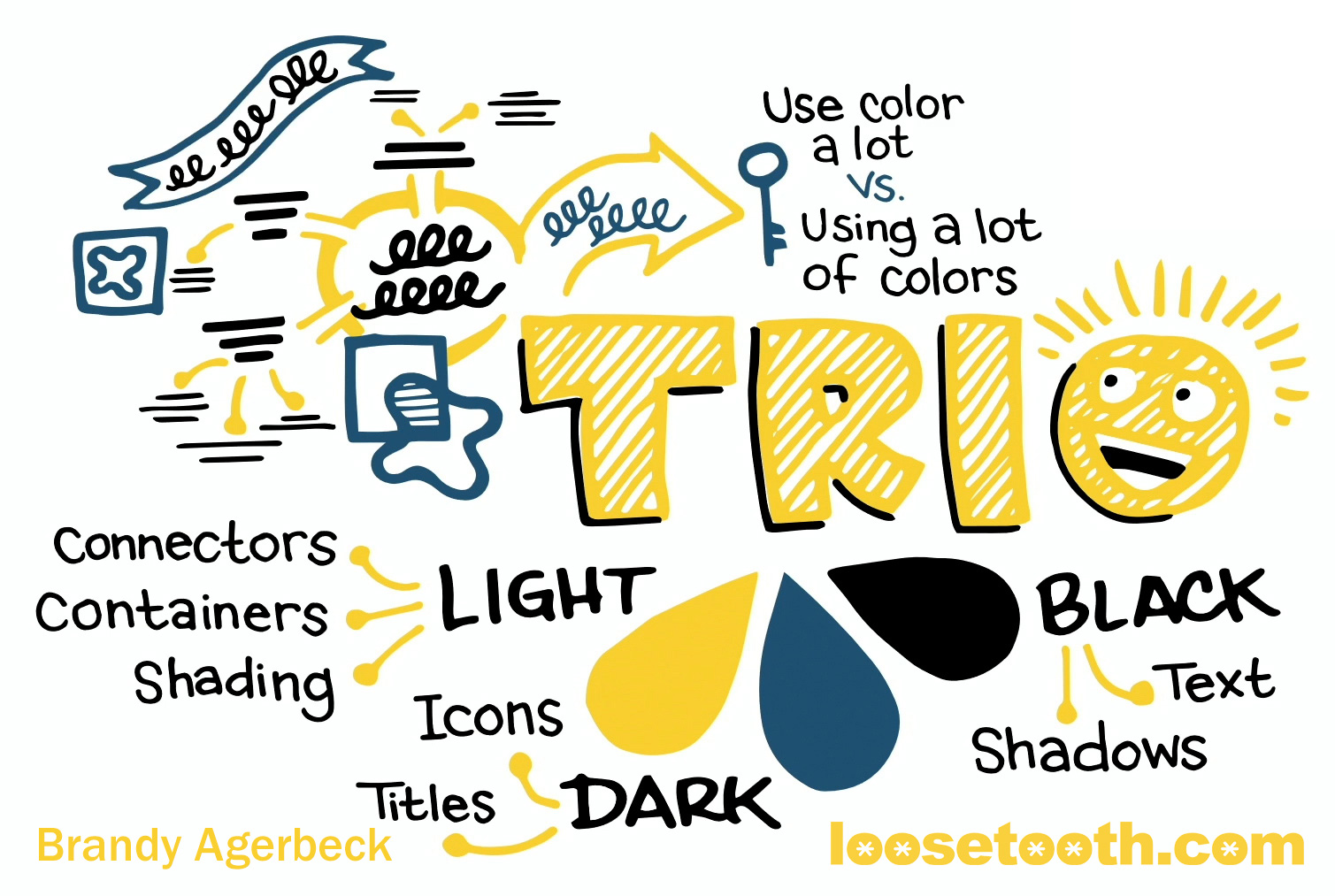
Why these visual choices work --
One, it is big. Its size shows it is a big important main idea.
Two, it is blocky. The style of block letters shaded with lines takes up space.
Three, it is both big and blocky. It is selected to be the one word in the drawing made with those choices. It is distinctly different than anything else on the page.
That's why 'TRIO' in yellow works in this particular drawing.
Veronique's question was right on. She's like, "Wait, I'm following this pattern. And now you're showing me THIS pattern."
Let's look at what that word those four letters would look like in the two other Trio colors --
But first, a distinction.
Another reason these yellow shaded block letters work it that it is one short word. If I were writing 'TRIANGULATION' or 'USING 3 COLORS TO START" what would happen?
1. It would be slow to write.,
2. It would take up a lot of the page.
Back to the other two colors --
Here we see that middle color with the word 'TRIO' in the dark blue.
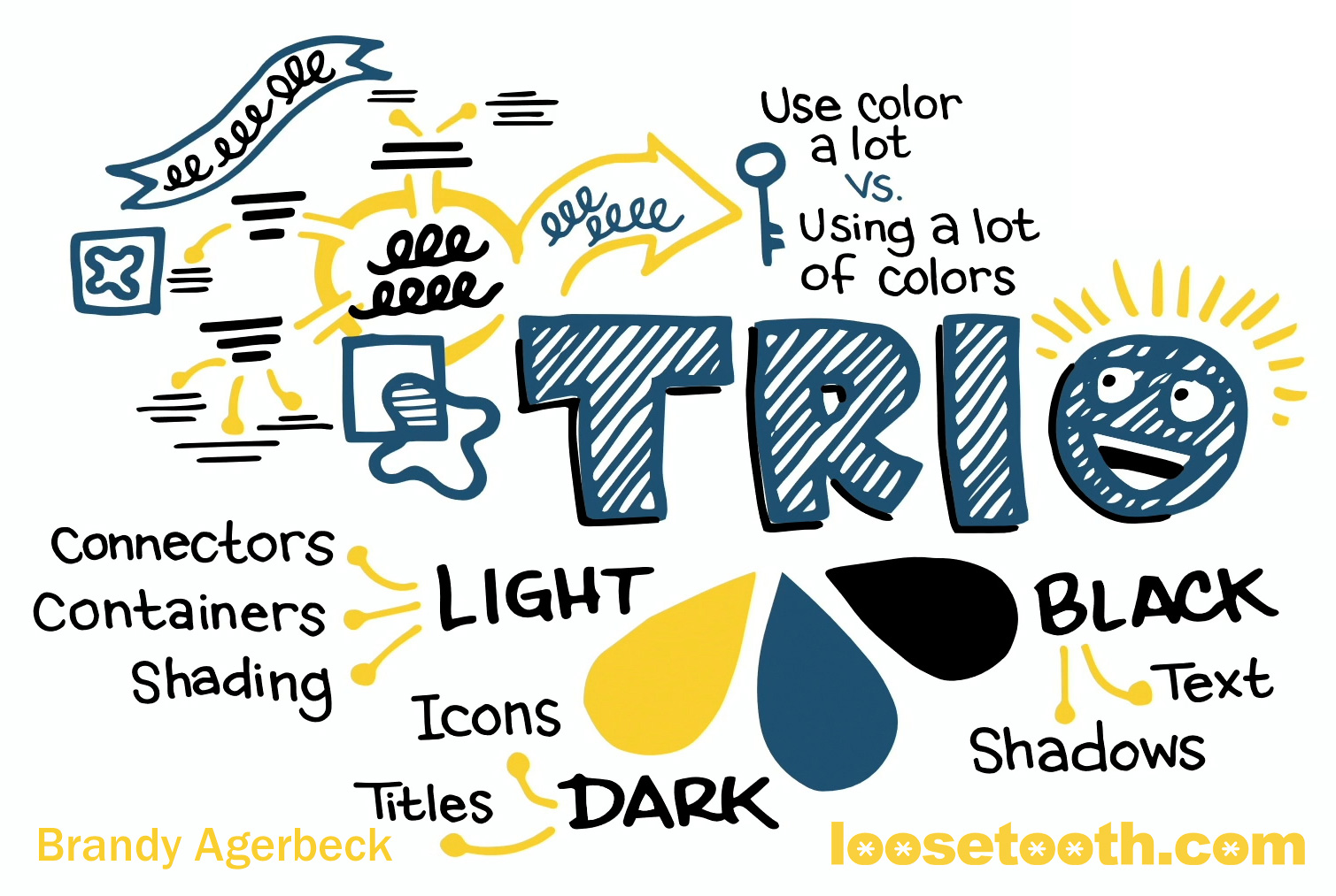
This works too.
Side-by-side, I would say the left feels more expansive, more breating room. On the right, the movement in more inward. The dark blue TRIO is more of a center of gravity. It feels more grounded.


You may think, "Oh, the dark blue feels so good." Others think, "Oh, that yellow is so much better."
We each have different ways we relate to different colors, different shapes, different everythings.
Personally, I think the dark blue makes the whole drawing feel more dense, with those 4 letter shapes shaded in it a darker color.
I think both the yellow and the dark blue are effective visual choices.
In contrast, I think 'TRIO' in black is less effective choice.
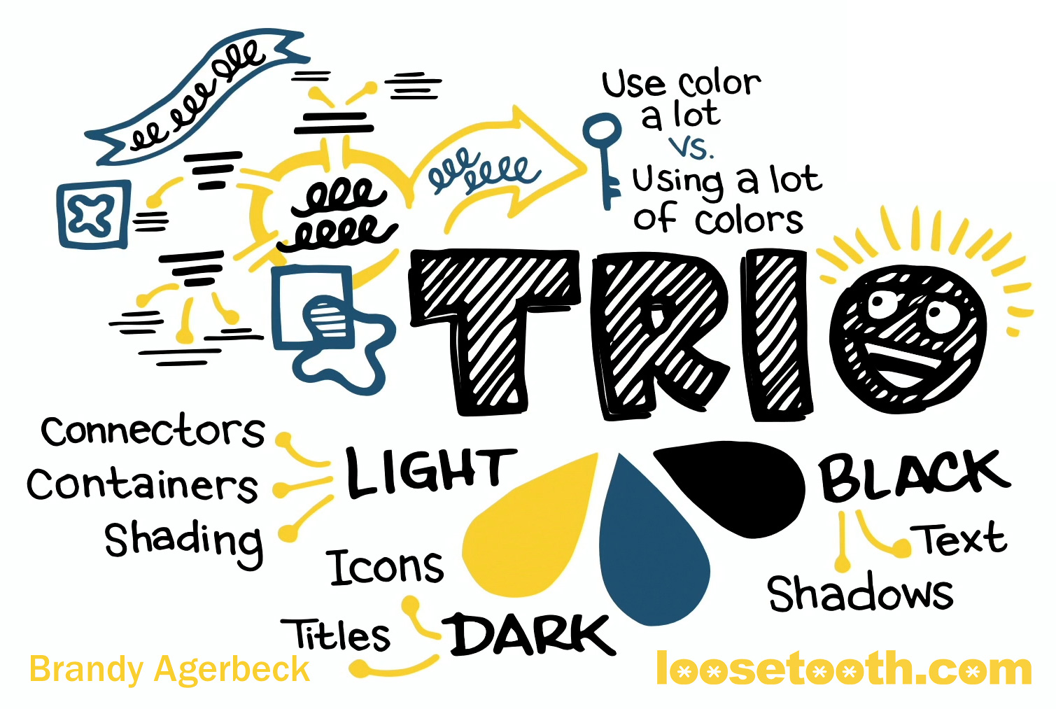
Why?
Not only does it feel even heavier and denser, now all the black lines are competing with each other.
- The black lines of the words throughout
- The black outlines of those four letters
- The black hatch marks within those four shapes
- The black drop shadows.
So here we're giving that color black four different jobs to do that are fighting each other.
I think this particular choice detracts and distracts.
Makes it a little bit harder a little bit slower to figure out what is what in this drawing. For you as the visual thinker, and also for your outside audience, if you are sharing this drawing.
Again, we are going into making a drawing with a chose Trio to give each of those three colors their own job. We may need to "employ" a third, fourth, or fifth color in one drawing, but now each one has its own function.
The Trio guides you into starting color choices that help you make more meaning and find more clarity in your visual thinking.
Thank you again to Veronique for asking the question. A great example of what you learn in The Agerbeck Method course, in the community, in the book.
Use The Trio in good health. I hope you are making beautiful choices, beautiful meaning, and making those drawings to make your next great thing happen.
